

A Management Tool user needs the Viewing Monitoring Results administrative permission to access the Dashboards page. Only data for the Clients that the user has the Viewing Monitoring Results permission for Clients is shown.
For best dashboard performance with PostgreSQL, update the database to version 13 or higher.
Customize the dashboards
You can change filter settings globally (every dashboard at once) or per-dashboard. Per-dashboard settings can be a subset or a wider range than the global filter — they’re independent.1
Open global filter settings
Click Dashboards in the left navigation, then click Filter Settings in the top right of the page.
2
Set the global filter
In the pop-up, choose Within the last or Between, set the date range, Users, and User Groups, then click Apply to All.
With large amounts of session data (or none), it can take up to 2 minutes — the default timeout — to generate the data. See troubleshooting.
3
Tune individual dashboards
Click the Filter Settings icon on any individual dashboard to set its own date range, users, user groups, and other dashboard-specific options.
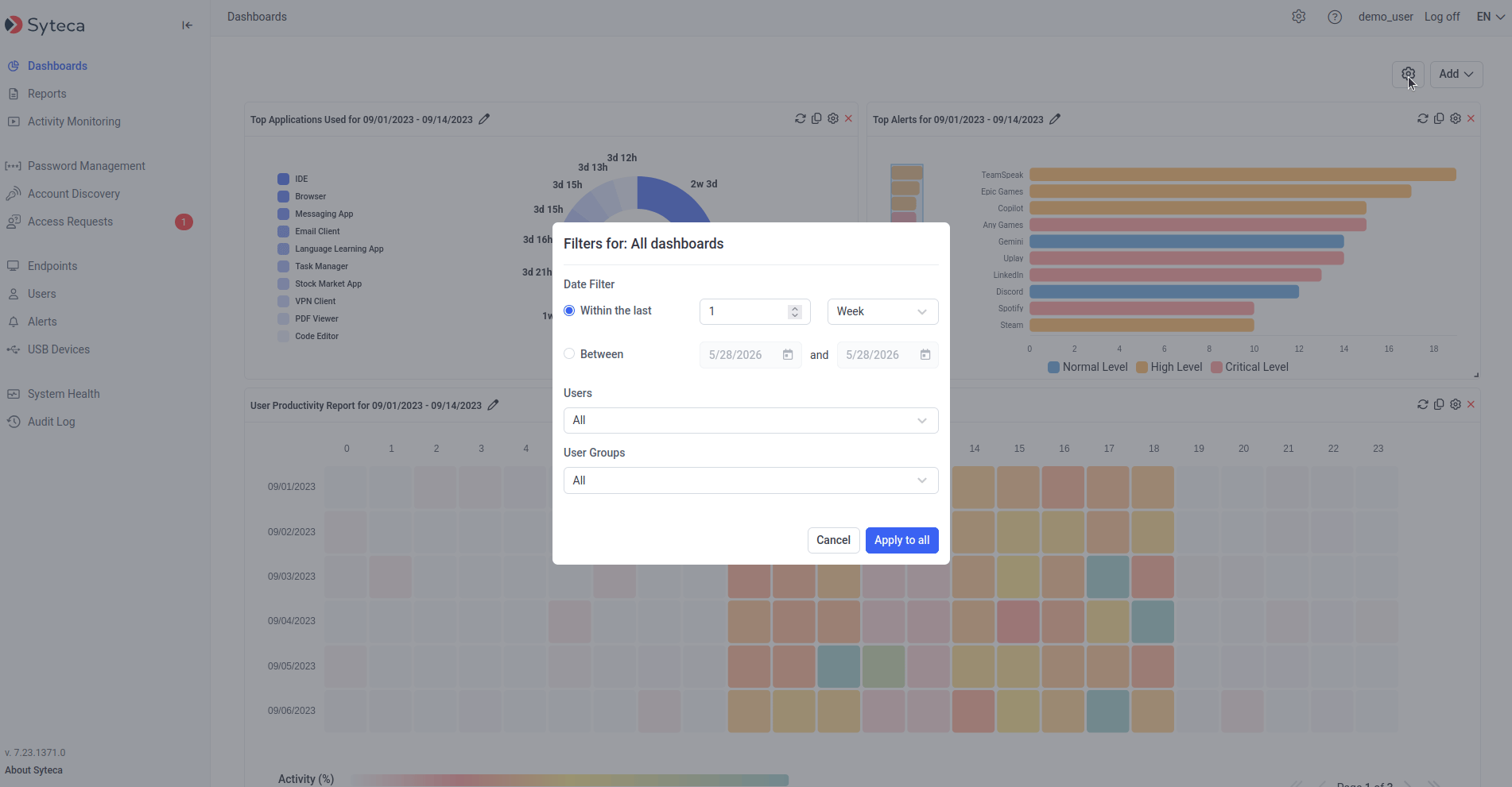
The Dashboards page with the global filter settings panel open.
Add, rearrange, resize, rename, hide
A maximum of 18 dashboards can be added to the page at the same time — multiple copies of the same type are allowed, each filtered independently.- Add a dashboard — click Add in the top right and pick a type.
- Duplicate a dashboard — click the Copy icon in any dashboard’s top right; a duplicate is added below it and can be filtered independently.
- Rename a dashboard — click the Edit icon next to the dashboard name.
- Resize a dashboard — drag the bottom-right corner.
- Rearrange — drag the dashboard header to a new location.
- Hide a dashboard — click the Remove icon in its top right.
The 9 dashboard types
One of each type is shown by default. Each entry below describes the visualization and the per-dashboard filters available.Total Idle Time vs Active Time
A bar chart of Total Active Time vs Total Idle Time per user (or per user group) across all their sessions in the date range. Active Time is Total Session Time − Total Idle Time. Up to 10 bars are shown; a vertical slider scrolls to the rest. Click any bar to open a session list, where the Play icon opens a session in the Session Viewer.Idle event recording is not implemented for SSH sessions on Linux Clients. Data with less than 1 minute of user activity is excluded.
Top Applications Used
A pie chart of the 10 applications with the longest total usage time across all selected users in the date range. Click a segment or application name to open a filtered session list. Filters: Date Filter, Users, User Groups.Data with less than 1 minute of user activity is excluded.
Top Websites Used
A pie chart of the 10 websites with the longest total time spent across all selected users in the date range. Lower-level URLs are aggregated under their top-level domain. Click a segment or website name for a filtered session list. Filters: Date Filter, Users, User Groups.URL monitoring is implemented for Windows and macOS Clients only — not Linux. Data with less than 1 minute of user activity is excluded.
User Productivity Report
A heatmap of average active minutes per hour, for each day in the date range. Each row is a day; each of the 24 cells is an hour, color-coded by activity percentage (see the Activity (%) key below the chart). Average Active Time per hour = sum of users’ active minutes ÷ number of users. Active Time for one user for one hour = one hour − Total Idle Time. Hover any cell to see the value; paginate with the page arrows below the chart. Filters: Date Filter, Users, User Groups.Idle event recording is not implemented for SSH sessions on Linux Clients.
Top Alerts
A bar chart of up to the 20 most-triggered alerts in the date range, ordered by frequency. Bar length is the notification count; bar color is the alert risk level. Up to 10 bars shown, with a slider for the rest. Click any bar for the underlying alert events (start date, Client name, user name, Play button). Filters: Date Filter, Users, User Groups.Latest Live Sessions
A sortable grid of the most-recently started sessions currently live, with Start, Client Name, and User Name columns plus a Play button. Filters: Users, User Groups, and Number of Sessions (maximum sessions to show).Sessions Outside of Work Hours
A bar chart of sessions started during non-work hours and non-work days in the date range, ordered by date. Up to 10 bars; slider for the rest. Click any bar for the session list (Client name, user name, start, last activity, finish, Play).Only sessions with user activity outside the specified standard work schedule are shown.
Rarely Used Logins
A sortable grid of users with the fewest logins in the date range. Columns: User Name (with the secondary-authentication user in brackets if enabled) and Sessions. Click a user name for their session details and a Play button. Filters: Date Filter, Users, User Groups, and Sessions fewer than (threshold for inclusion).Rarely Used Computers
A sortable grid of Client computers with the fewest sessions in the date range. Columns: Client Name and Sessions. Click a Client name for its session details and a Play button. Filters: Date Filter, Users, User Groups, and Sessions fewer than (threshold for inclusion).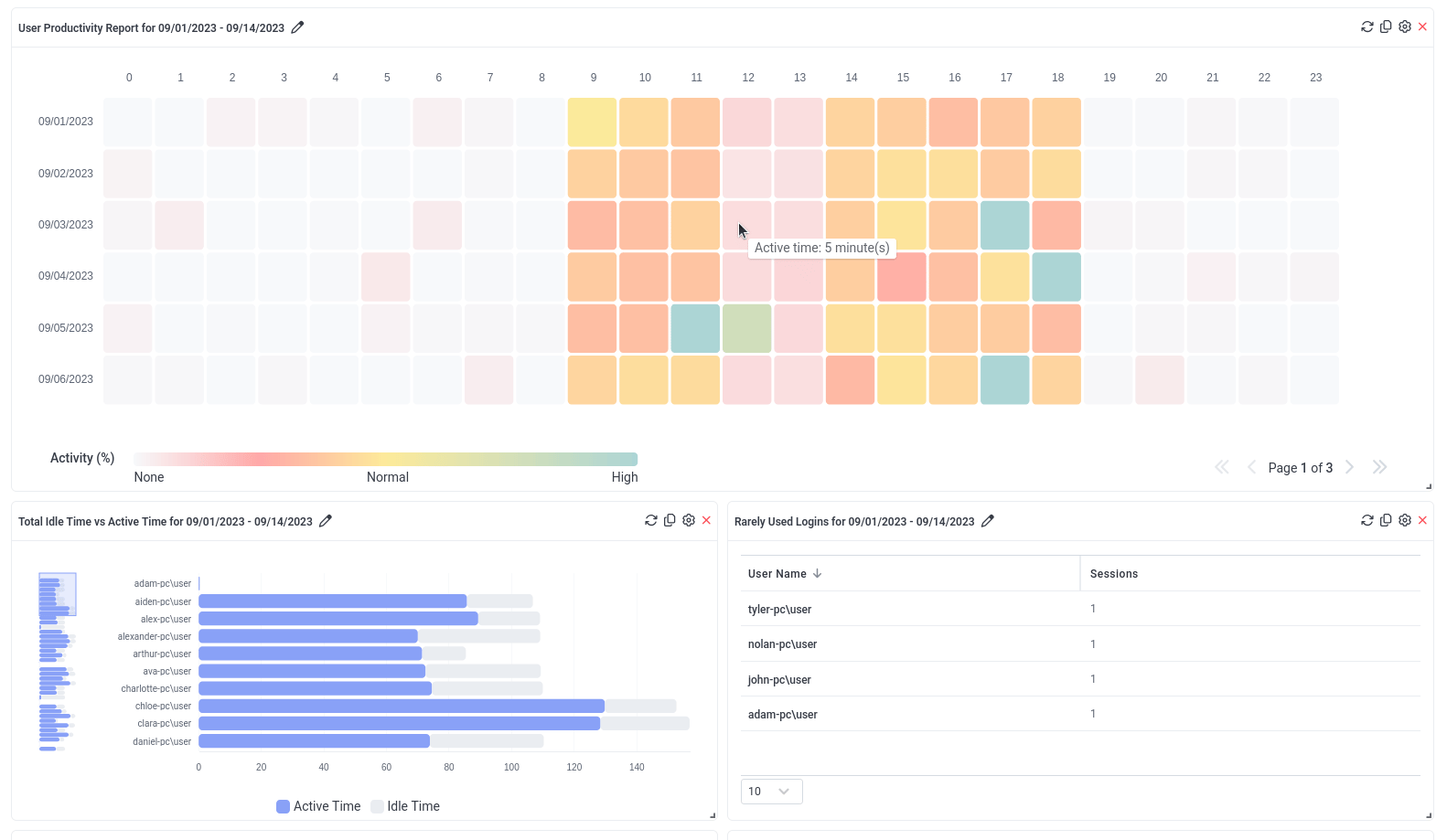
The Dashboards page showing several user activity dashboard types.
Troubleshooting
When dashboards are generated with large amounts of (or no) session data, you may see errors like:- There is too much data to process.
- There is no data for the selected time range.
- The request timed out. Could not get the data for the “<dashboard name>” dashboard.
- Narrow the data range in the filter settings.
- Increase the timeout in the
EkranServer.Settings.configfile by editing theDashboardCommandTimeoutkey:
EkranServer.Settings.config
120000 (milliseconds). The file is in C:\Program Files\Ekran System\Ekran System\Server on the Application Server host.
Related
System Health dashboards
Storage, CPU, memory, database, and Client status.
Audit log
Tamper-evident record of administrator actions in the Management Tool.
Session Viewer
Open from any “Play” button in a dashboard.
Generate reports
Scheduled and ad-hoc reports for offline analysis.